


ProSpray is a ProSpray is a Minnesota-based pest control and lawn care company that came to WolfPack Advising ready to level up their digital presence. They weren't losing business, their reputation was already solid. What they wanted was a website that matched that reputation: professional, credible, and serious enough to convert new visitors into paying customers.
This was a collaborative project. I owned the theme selection, services pages, About page, and Contact page. My lead designer handled the homepage. Together we delivered a cohesive site that gave ProSpray the modern presence they were after.
ProSpray wasn't in crisis. Their reputation was solid and customers kept coming back. But their website wasn't keeping up. The design felt dated, and for a service business trying to convert first-time visitors who don't know them yet, looking credible online matters as much as the service itself.
The brief was clear: modernize the site, match the professionalism of the actual business, and make it easy for new customers to understand what ProSpray offers and take action.
Services Pages


Structured to answer the customer's questions in sequence: what it is, what's included, and how to book. Clarity was the conversion strategy.
Design Decision
Service pages for trade businesses have one job: tell the customer what you do, why it matters, and how to book. I structured each ProSpray service page to answer those questions in sequence. Clear service name, what's included, who it's for, and a direct CTA. No filler, no buried information. For a company like ProSpray whose customers often compare multiple providers, clarity is the conversion tool.
About page


Built as a trust tool, not a biography. The goal was to make a first-time visitor feel confident about ProSpray before they ever made contact.
Design Decision
A lot of trade business About pages read like a résumé no one asked for. I approached ProSpray's About page as a trust-building tool. Focused on what they stand for and why a customer should feel confident choosing them, not just how long they've been in business. The goal was to make a first-time visitor feel like they already know and trust ProSpray before they've even made contact.
Contact page
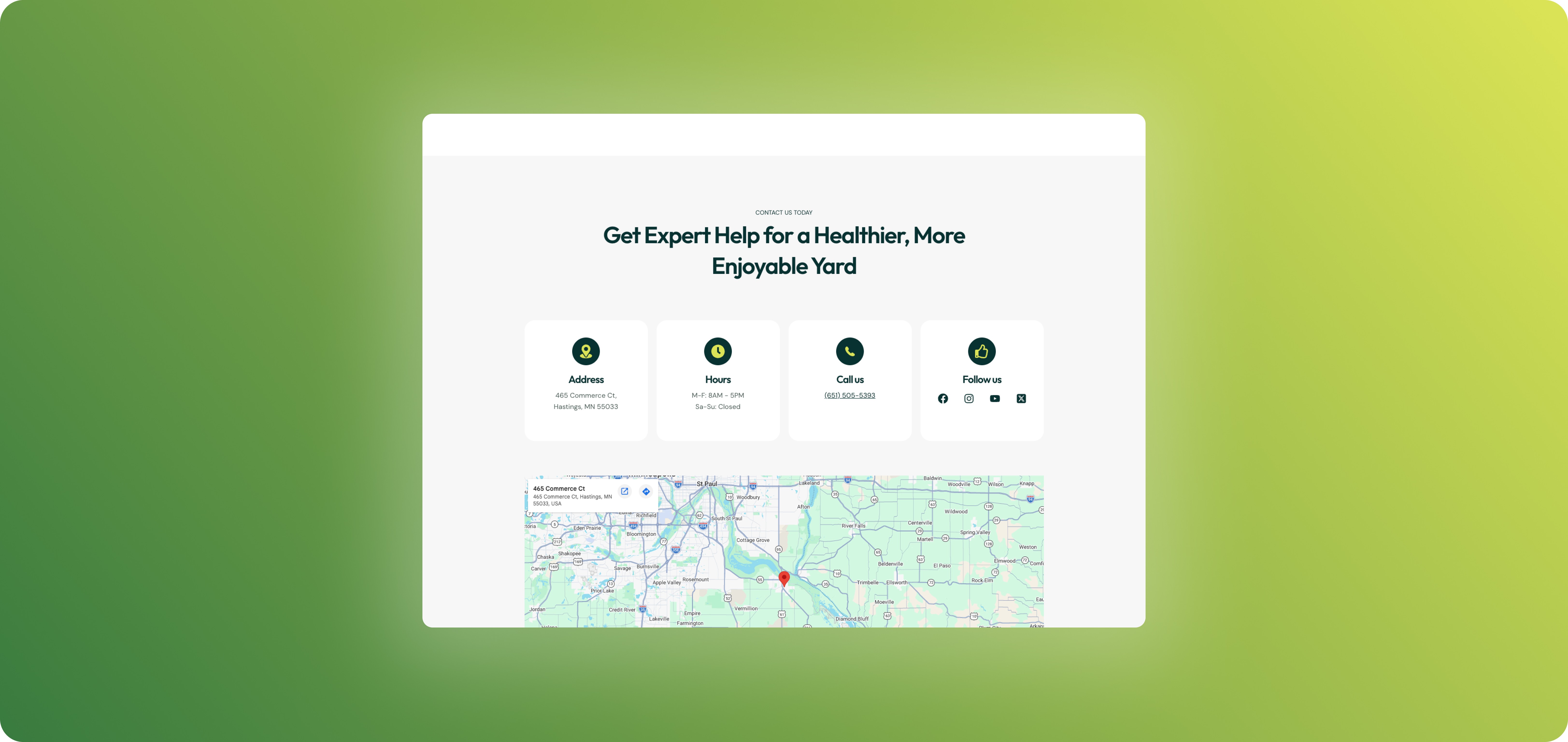

One form, direct contact info, no friction. The fewer steps between a decision and an action, the better.
Design Decision
Contact pages lose customers when they're confusing, cluttered, or slow. I kept ProSpray's contact page focused: one clear form, direct contact information surfaced visibly, and no unnecessary friction between a visitor deciding to reach out and actually doing it.


Structured to answer the customer's questions in sequence: what it is, what's included, and how to book. Clarity was the conversion strategy.
Outcome
ProSpray came in with a solid business and a website that didn't reflect it. The site that launched gave them a credible, professional digital presence that matches the quality of their service / Clear enough to convert first-time visitors and trustworthy enough to hold up against competitors.
Working collaboratively on this project was its own design challenge: matching the visual language and tone of a homepage I didn't design, while still making clear decisions within the pages I owned. The result is a site that reads as one cohesive product, which is exactly what it needed to be.